My 30DayMapChallenge 2021
The initiative of #30DayMapChallenge was created by Topi Tjukanov and it happened on twitter during November. Get to know the official website 30daymapchallenge.com and all the inspiring creations of the geospatial community all over the world.
It was difficult to handle all 30 maps but not impossible to do some. I discovered a lot of talented cartographers in November 2021 who inspired me with new ideas. I am glad I was part of this wonderful initiative and I discovered that every day is a good day to do maps. Some days the maps were done with friends/colleagues members of @digigeolab Digital Geography Lab - University of Helsinki
My profile Bryan R. Vallejo
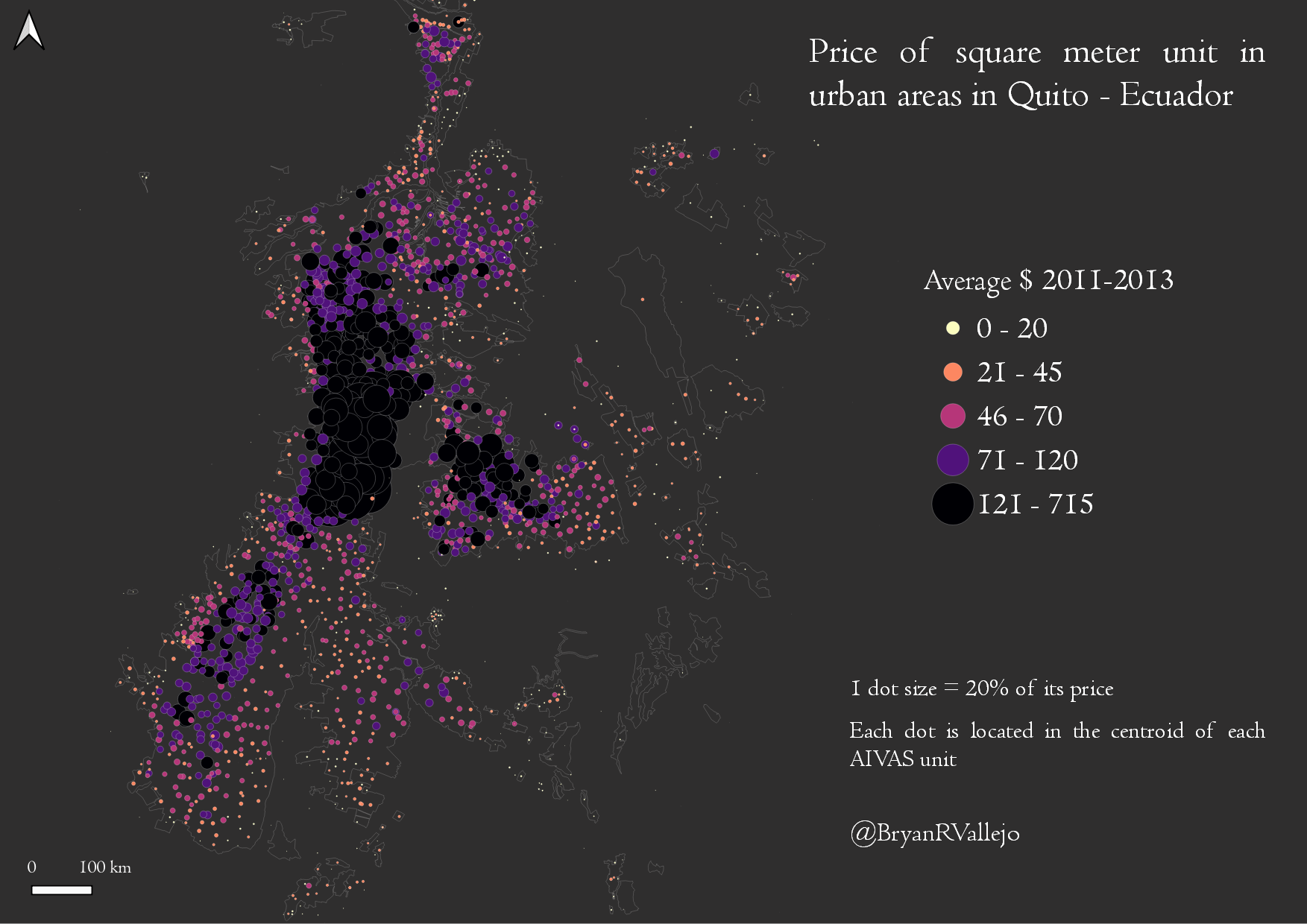
Day 1: Points
Feels good to handle #Quito datasets since a long time ago. Land prices at CBD and Valleys are well represented in this dot map #QGIS
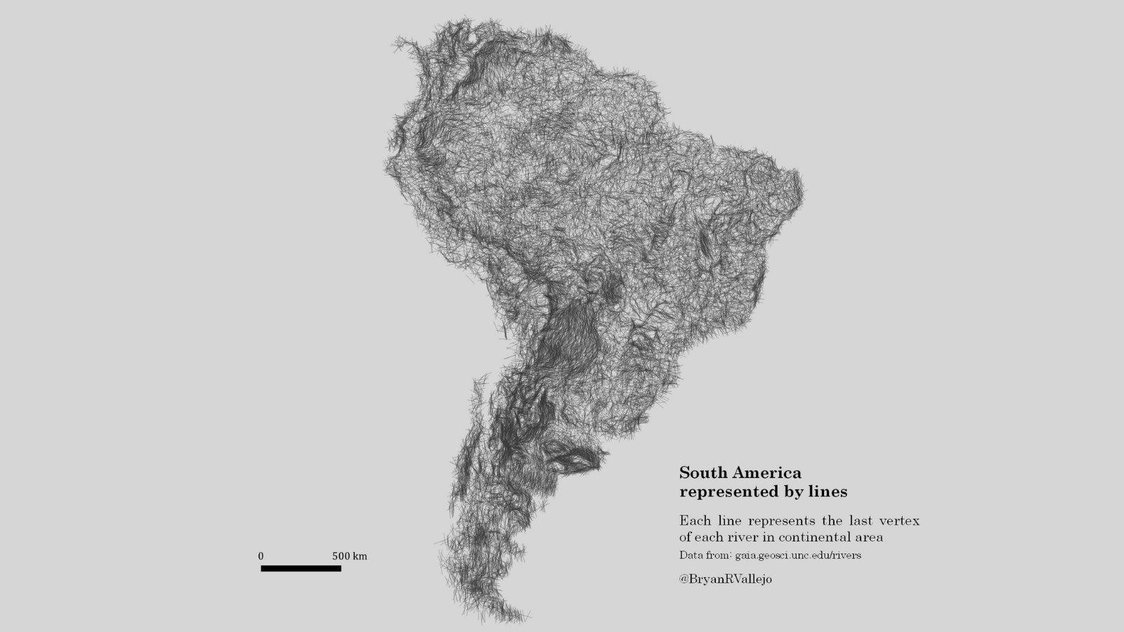
Day 2: Lines
#SouthAmerica by #lines Each line represents the last vertex of each #river in the continental area. Playing with Lines and continental shape #QGIS. Data: http://gaia.geosci.unc.edu/rivers
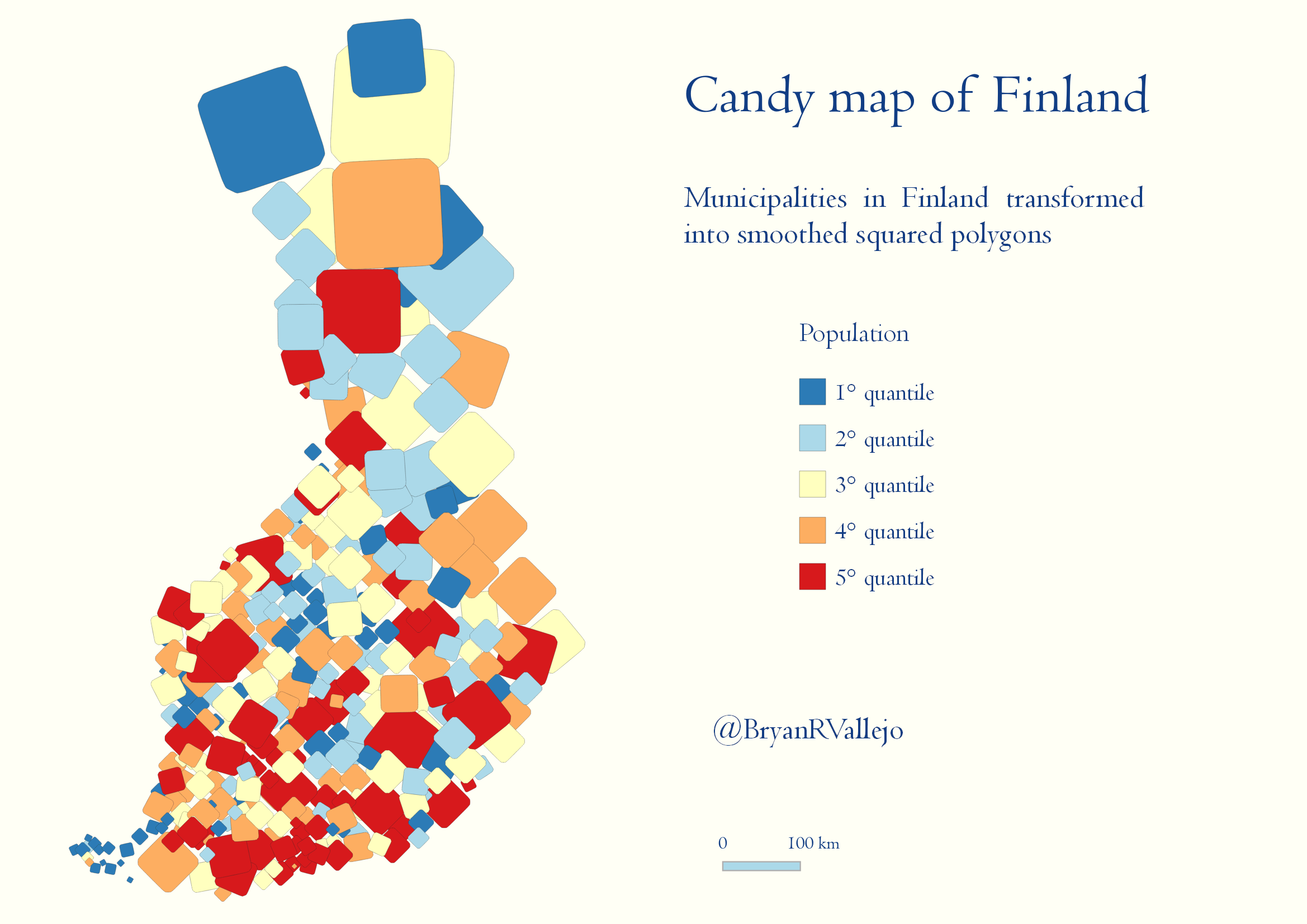
Day 3: Polygons
Candy map style. The #population of municipalities in #Finland represented by smoothed squared #polygons #QGIS and geometry generator
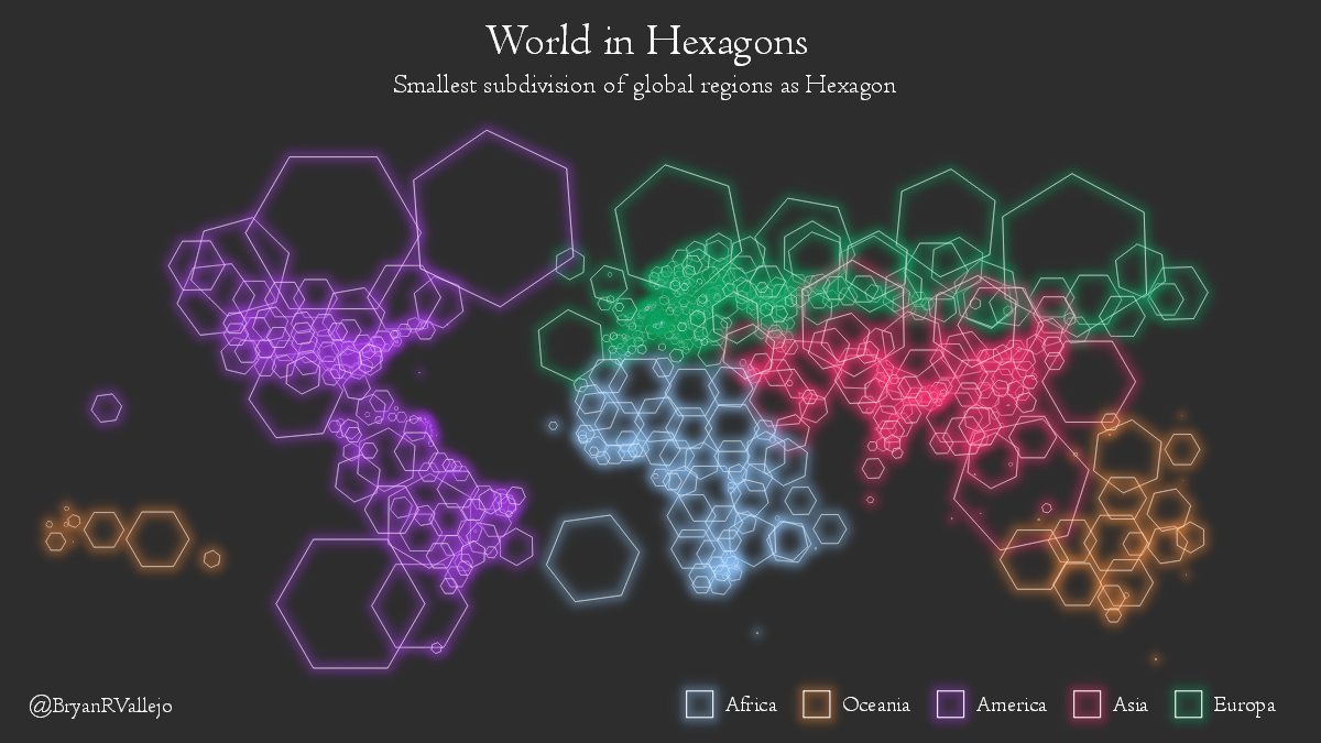
Day 4: Hexagons
Still standing Smallest subdivision of global #regions as Hexagon. Data from https://gadm.org my new favorite #QGIS
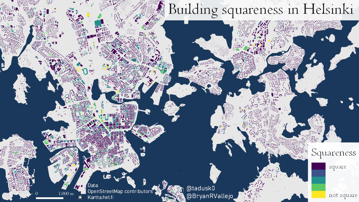
Day 5: OSM
It's hip to be square? Squareness of buildings in Helsinki. OSM data loaded swiftly with #pyrosm by @tenkahen and squareness calculated with #momepy by @martinfleis. Visualization in @QGIS
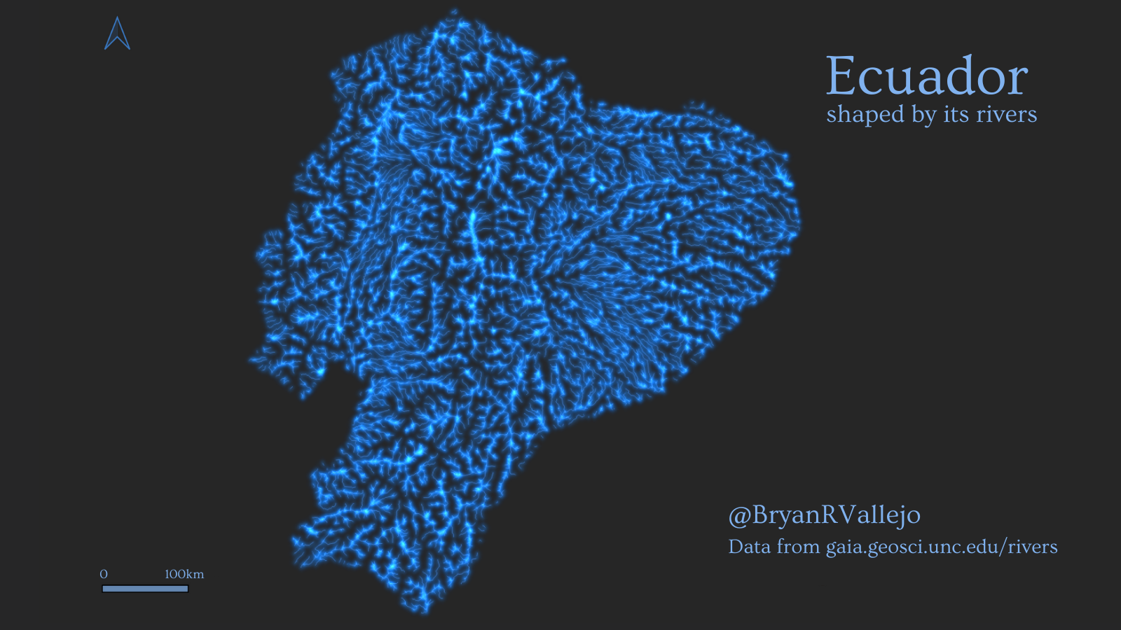
Day 8: Blue
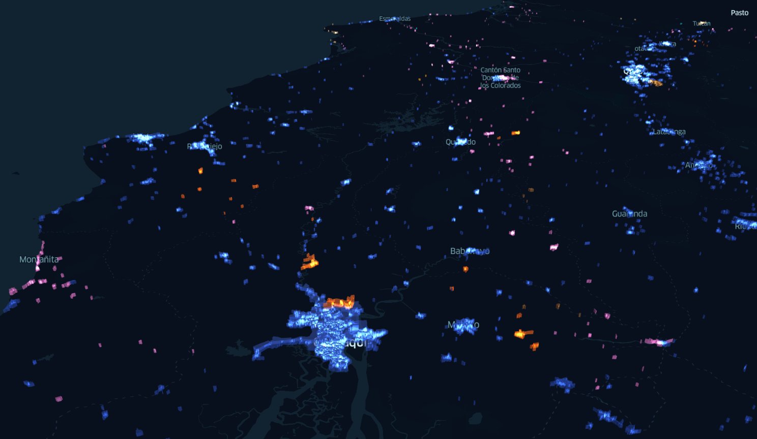
Ecuador is shaped by its rivers’. The mountainous, tropical country has an extraordinarily dense hydrological network. Data from http://gaia.geosci.unc.edu/rivers @GeoHelsinkiUni @KumpulaScience @HelsinkiUni
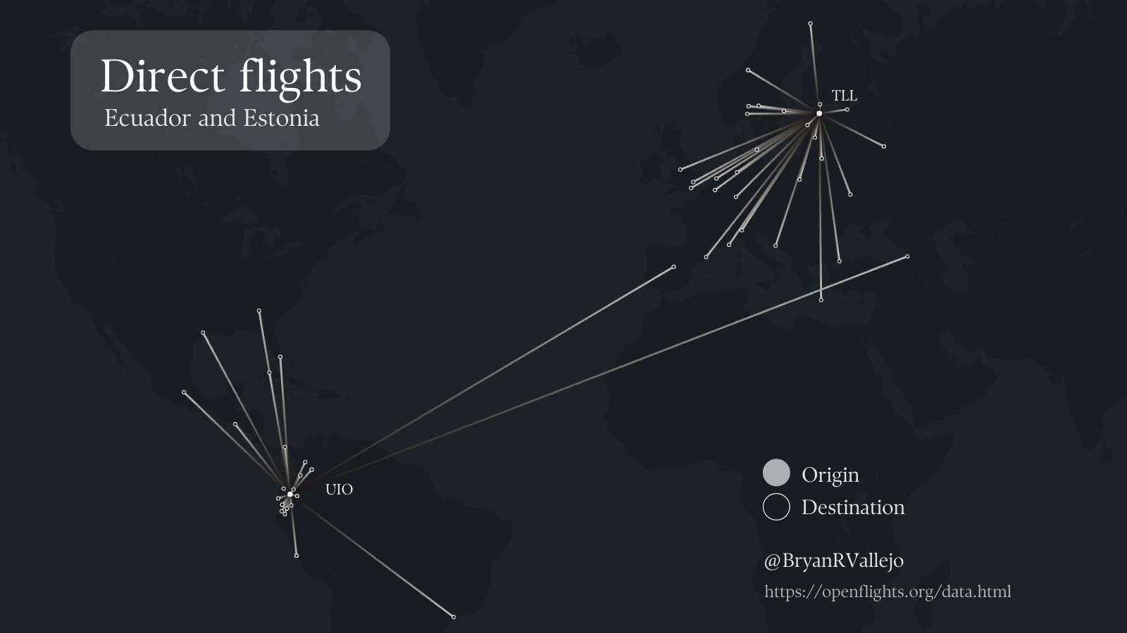
Day 9: Monochrome
Direct flights from the capital city of #Ecuador and #Estonia. I just recalled a dataset I did while I was in @unitartu #Tartu with this historical database of flights (2014) from https://openflights.org/data.html
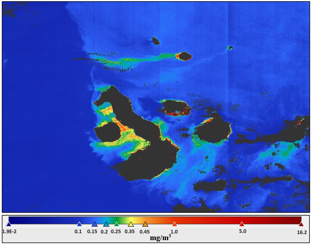
Day 10: Raster
#Geography is fascinating! "Chlorophyll concentration during El Niño Warm Ocean Current in the Galápagos Islands". I learnt this at @unitartu #geoinformatics C2RCC water processing #Sentinel3 OLCI March #Galapagos #Ecuador #Copernicus
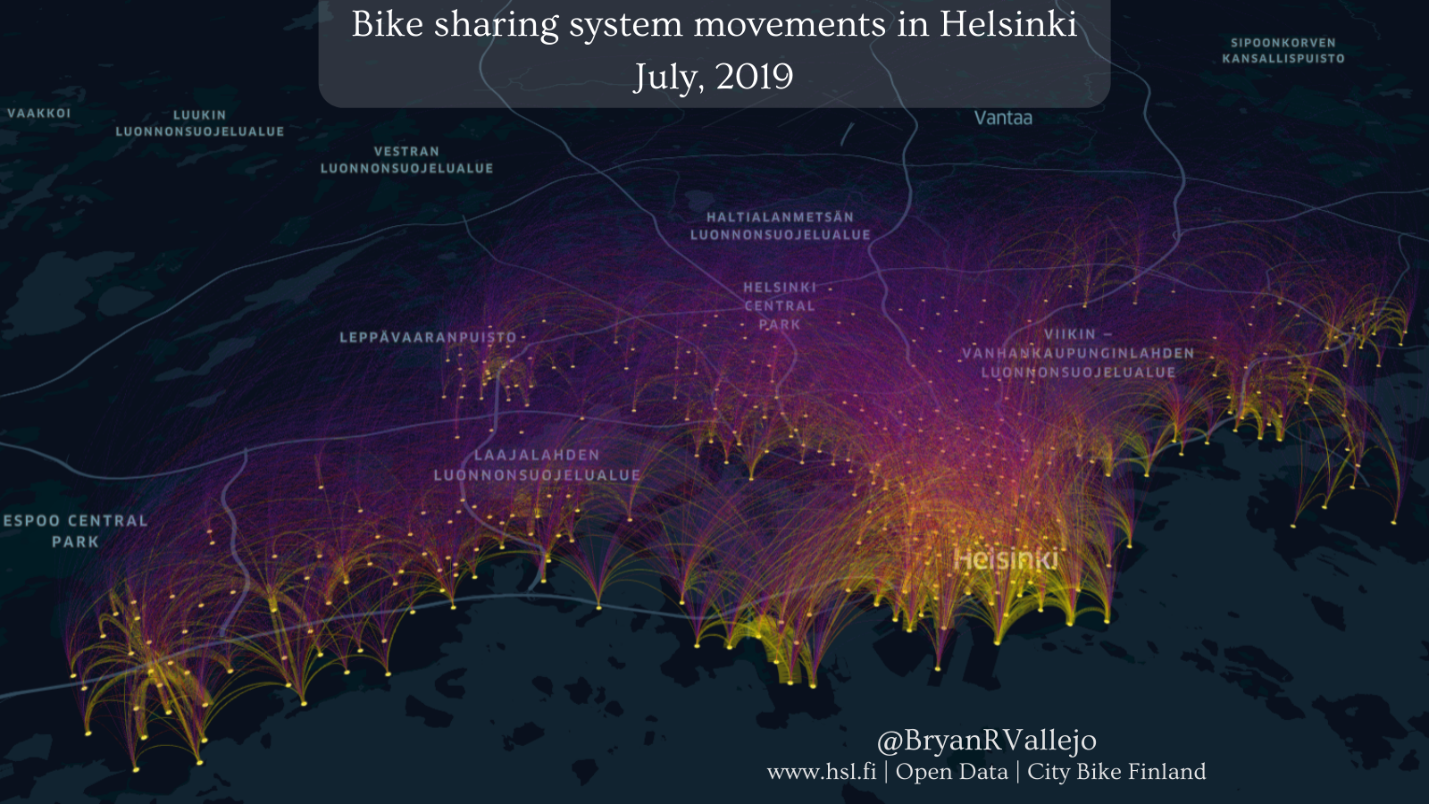
Day 11: 3D
Helsinki metro-region bike-sharing movements, aggregated between bike stations. Seems it was a busy July (2019) in #Helsinki city centre. Data: @HSLdevcom Online demo: https://bit.ly/31UE3fD @GeoHelsinkiUni @helsinkiuni
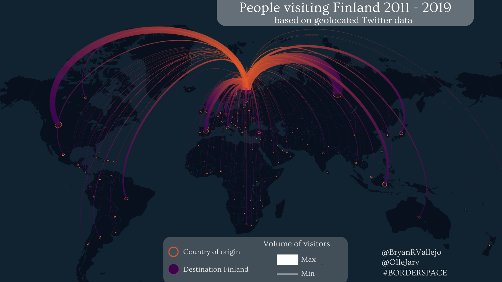
Day 12: Population
Distribution of foreign people visiting #Finland from Twitter data. Using our #opentools to study cross-border mobility http://bit.ly/3FaUpPx. With @ollejarv w/ #keplergl #GeoHelsinkiUni @KumpulaScience @HelsinkiUni Digital Geography Lab
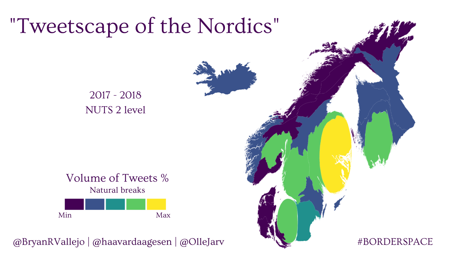
Day 14: Map with a new tool
Cartogram of Nordic mobility derived from Twitter data on NUTS2-level. With @OlleJarv & @haavardaagesen w/ #Cartogram3 in #QGIS @GeoHelsinkiUni @KumpulaScience @helsinkiuni
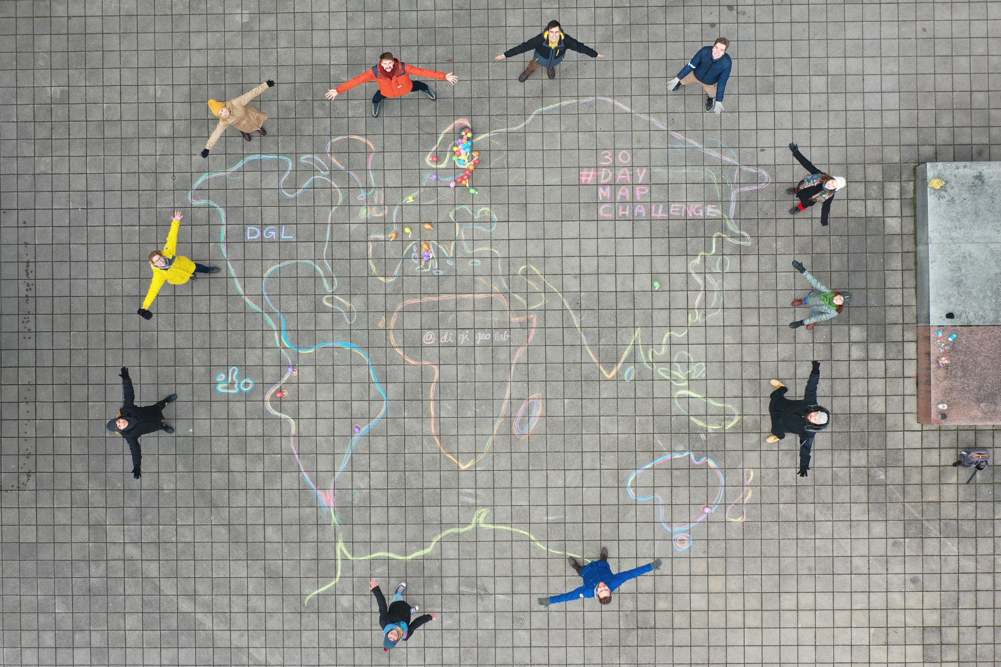
Day 15: Map without using a computer
Where do Digital Geography Lab members come from? Origins as balloons on hand-drawn world map! Thanks @apaarlah for piloting the drone! Making this was fun! @GeoHelsinkiUni @KumpulaScience @HelsinkiUni Digital Geography Lab
Day 16: Urban/Rural
Urban areas by census units #EC Urban sectors classified by source (i.e. orthoimage, google maps, etc), all the rest is rurality. Demo: https://bit.ly/3HsRbZG @unfoldedinc #30DayMapChallenge #INEC
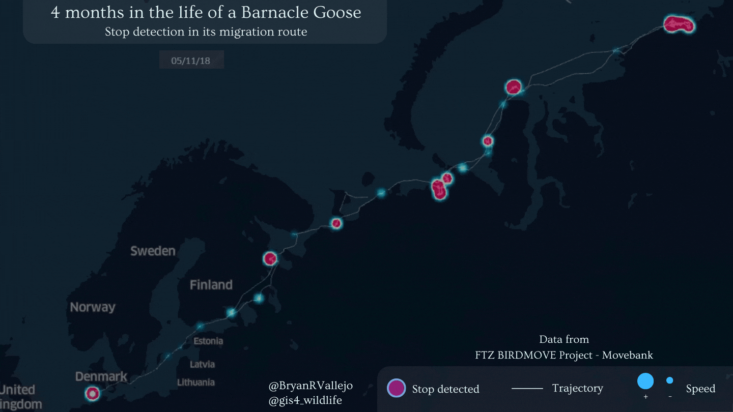
Day 20: Movement
The main stops in bird’s migration: “4 months in the life of a Barnacle Goose”, stops detected in trajectory. Made with @gis4_wildlife and #movingpandas @underdarkGIS #MovementAnalysis #wildlife #MovementEcology
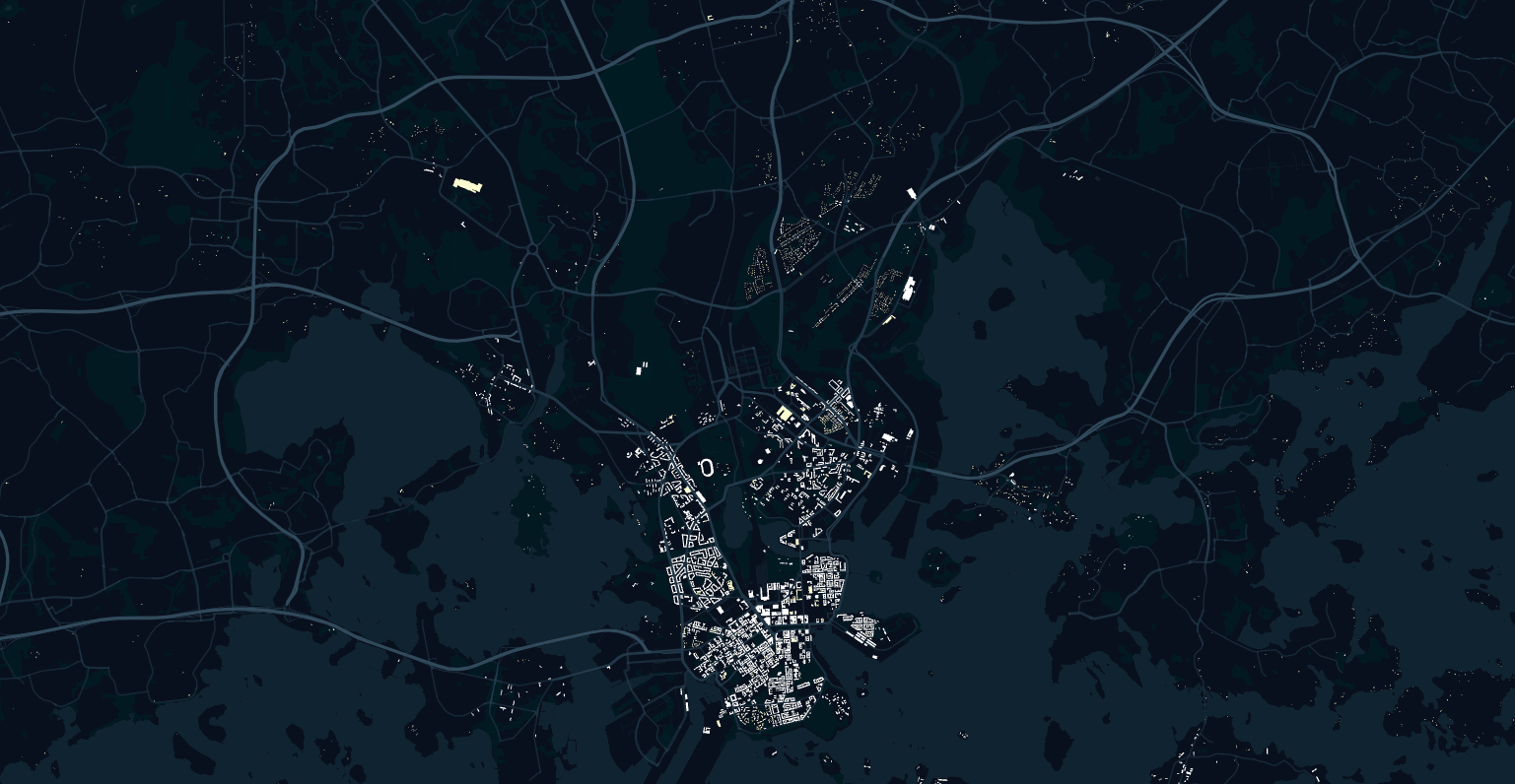
Day 24: Historical map
Building development in Helsinki since the 20’s. #ISSonVis 2.21
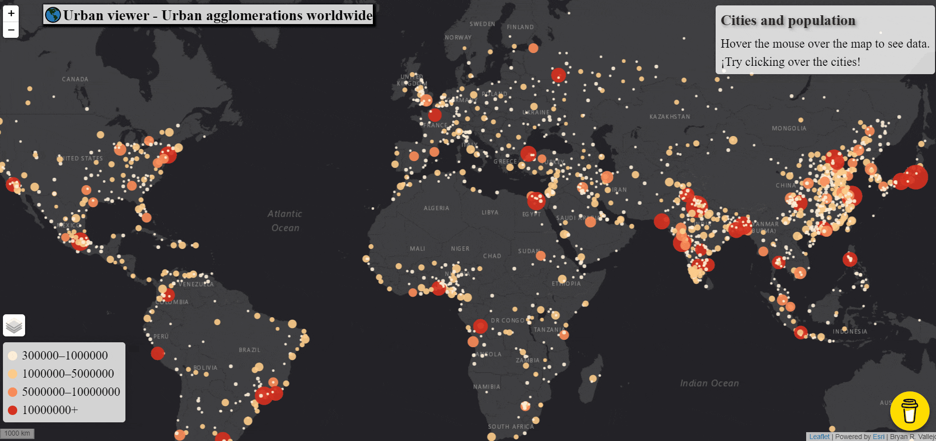
Day 25: Interactive
Urban agglomerations viewer. It is just nice to be hanging around checking the names and population of the world cities. Demo here: https://bryanvallejo16.github.io/urban-viewer-worldwide/ and tutorial in Towards Data Science here": https://bit.ly/3xmcqaN @TDataScience #leaflet #UnitedNations
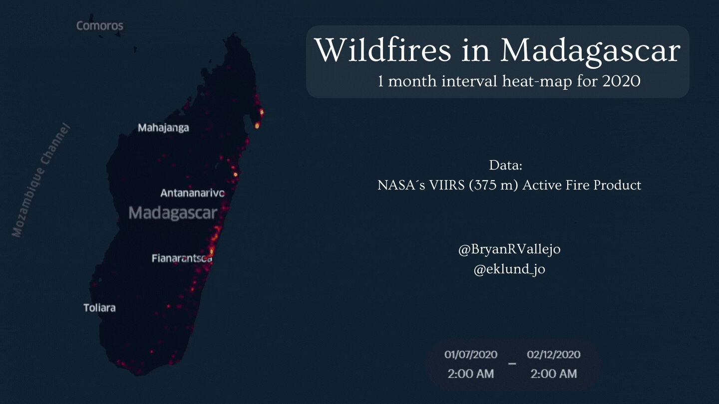
Day 27: Heatmap
’Wildfires in #Madagascar for 2020’ is a ‘heat visualization’ showing wildfire concentration with a 1-month interval, highlighting West-East spread. @eklund_jo in @unfoldedinc. Demo: https://bit.ly/3p0yCmX
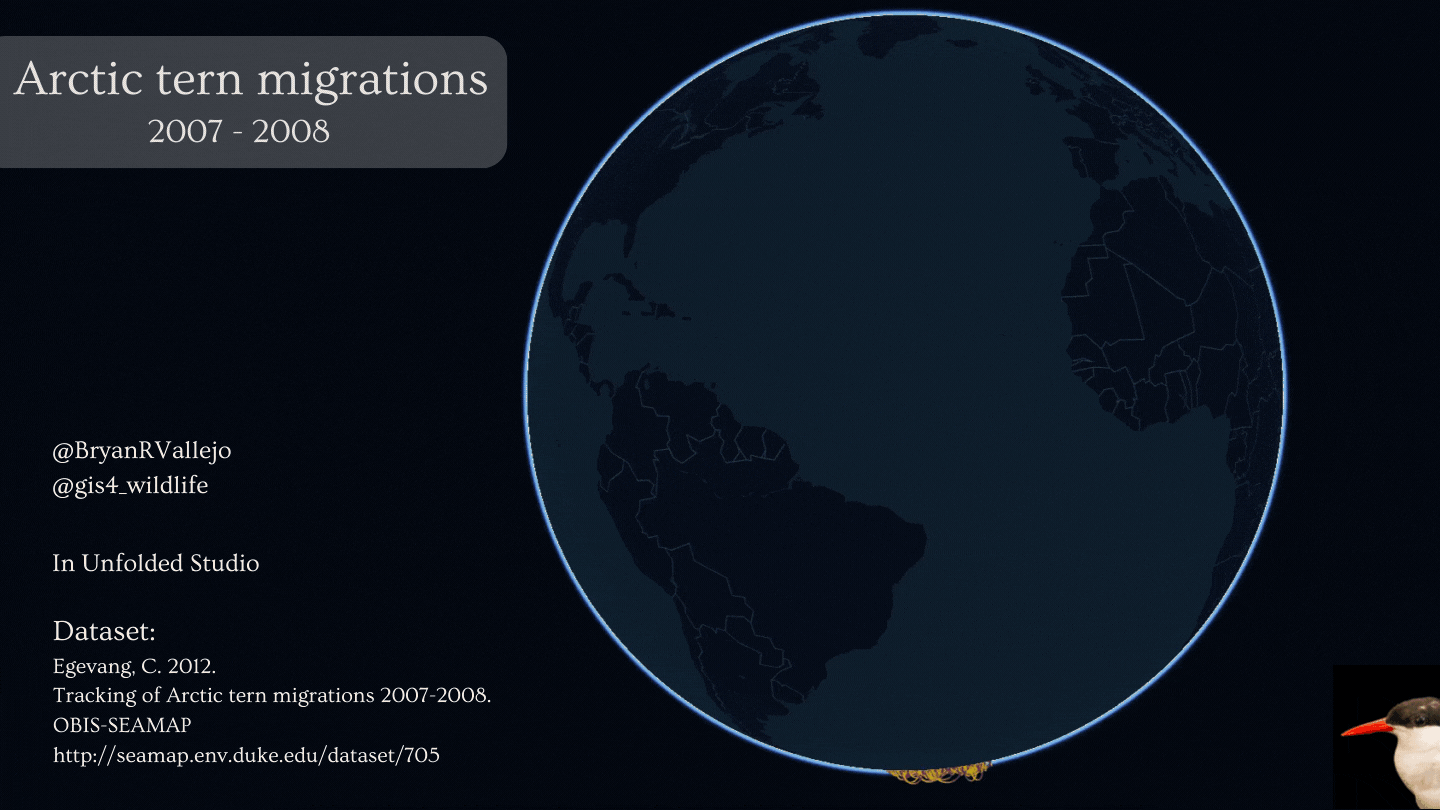
Day 28: Earth is not flat
The Arctic tern knos about rounding the planet. This globe map shows its migration pole-to-pole. @OBISNetwork